This Chart Tells Us What’s REALLY Going On In The Market
Today, I’m going to show you exactly what I’m looking for to see if this is simply a market correction or a sign of more ominous things to come.
While there are numerous charts, graphs and statistics that one can watch, the one I’ll be keeping my eye on is the Advance-Decline Line (AD Line).
It’s pretty simple. The AD Line is a breadth indicator based on Net Advances, or the number of rising stocks less the number of declining stocks. Net advances is positive when the number of advancing stocks exceed declines — and negative when declines outpace advances.
The AD Line is a cumulative measure of net advances. It rises when net advances are positive and falls when it’s negative.
I like to think of this breadth indicator as a telling sign of what’s going on beneath the surface. For instance, if the S&P 500 is hitting new highs, you would look at this indicator to make sure it, too, was advancing and hitting new highs. This would show strong participation in the market and confirm the bullish trend. However, if the AD Line fails to keep pace with the underlying index, this is a sign of weakness in the market, signaling a bearish divergence.
Let’s look at an example…
The chart below shows two bearish divergences in the NYSE AD Line from June to November 2007. As you can see, the NYSE Composite moved to new highs in July; however, the AD Line peaked at the beginning of June — telling us that there wasn’t strong participation in the new high, and thus setting up the first bearish indicator.
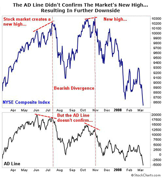
As you can see, the NYSE Composite Index fell over the next couple of months, but then it surged to new highs in October. Once again, the AD Line fell well short of its July high, forming another bearish divergence.
Here’s what this chart looks like today…
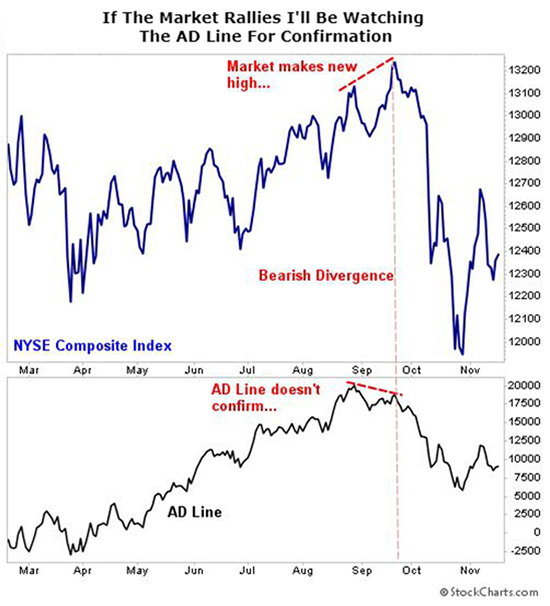
As you can see, the AD Line is a ways off from its late-August highs. In order for this bull market to continue at full strength, we need to see the AD Line — along with the index — rally above that late-August high. If the market marches higher but the AD Line doesn’t follow suit, then we know that it’s a false rally and that more downside pressure is on the horizon.
Remember, we need the AD Line to confirm the new highs of the market. Otherwise, we could be entering a bear market. My premium readers and I will be closely watching this critical chart moving forward.
Another Sign Of Concern
One more sign that investors are worried is the flight toward more conservative stocks. For instance, my system has been flagging consumer staples stocks in the last few weeks, which are known more for their stability than their growth.
And so far this year, the top-performing sectors are healthcare, consumer staples and utilities — three classic defensive sectors. This shift in market leadership is a clear sign that investors are more pessimistic about what lies ahead and are bracing for what’s to come.
The Takeaway
The current market environment — and the signals my system is sending — have me cautious about adding any new picks right now. That said, if I see an incredible opportunity, I’m not afraid to pounce.
The point is, in times like these, it’s best to weather the storm and wait for things to work themselves out. Remain disciplined and vigilant. We don’t have to trade every week. Money isn’t made by trading, it’s made by being patient and waiting for the trade.
P.S. DECLASSIFIED: The F.U.S.I.O.N Profit System…
Discover the system that uses a unified formula to make big gains in less time. If you’re tired of investing in stocks that go nowhere, then you need to read this…